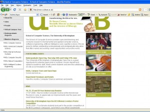
The first page of the CS website of the Uni. of Birmingham displays random images οf the links to the undergraduate/postgraduate and research sections of the site. I visited the website today and the following is a screenshot of the page I viewed.
So, the experience of a CS undergraduate in Birmingham=Pub drinking/eating/socialising…whatever… I don’t mind the message the image is trying to put across (even though I should probably mind)! However, I think the moment you visit the website this image strikes you as contradicting the site’s look and feel. What do I mean? In general the page is what you would expect to see in a CS department’s page… nerdy stuff! On the top there is the brain with the monitor to emphasise the strong AI background of the department. The image for the research is full of post-it notes. The image with the undergraduates in the pub… well it just doesn’t fit!
